Dear Instagram
Estimated read time: 2 mins
(Full disclosure: I showed this post to a friend of mine and he quickly showed me Vsco Cam which does something similar…didn’t mean to do that)
Instagram, I love your product and I did expect a lot of UI growth from you with this new update and I was more than disappointed. I know your new push was to focus on the photo-taking experience, but the filter selection is a major aspect of that experience and it seems like you guys forgot it this time around.
Your filter selection UI is incredibly annoying, I hate it. I also hate the names, what the hell is a “Walden”?
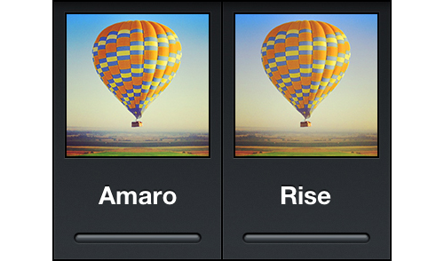
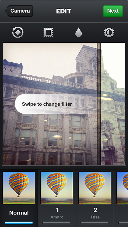
You’re probably referencing this:
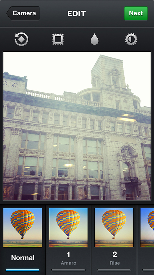
But I wish you were referencing this:

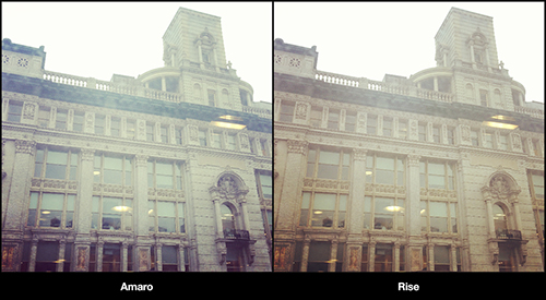
I see that you’ve made the filter icons bigger in this update so people can see the effects more but bro, what’s the difference between these two when you’re looking at it on the phone? The effects you’re portraying is way too subtle here.
The actual difference is pretty drastic.
And maybe the effect just depends on the individual picture and I get that. But the point is, your filter names and the effect icons doesn’t mean anything when it comes to the actual effect of the picture itself.
The physical aspect of selecting the filters is sort of a pain here too. I don’t want to tap on each filter to browse through them. I mean I think it’s okay but there may be a better option:
Each filter is actually an individual element that is overlaid on top of the original image.
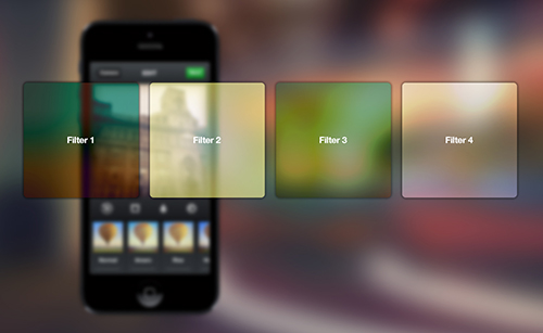
This creates a physical reference to actual lenses being swapped in and out. The filter can be changed by swiping left and right instead of tapping on a particular icon. Besides everyone knows swiping feels better than tapping.
Now when I’m in my filter selection flow, I generally go through each and every single filter (except the B&W cause everyone knows that’s for chumps) making a mental note of the filter I might want to come back to after I’ve explored all my filter options. But by the time I’ve gone through all my choices and want to test out the 2 or 3 filter options I’ve picked out, I’ve already forgotten the filter names.
“Shit was it Rise, or Hudson?”
“Was it Nashville or Valencia?”
I can never remember the names of them when I go back cause I don’t want to use that extra headspace. I’m lazy and I don’t want to think about your filter names when I’m already over exhausting my mental capacity to pick a filter for my photo. Now to solve this, you can just use numbers. You have 19 filters (including Normal). Now when I find a filter I like, instead of taking a mental note of “Earlybird” I can say ”10”.
“Remember 4 and 10”
I think that’s a lot easier.
So the flow here would be something like this:
1. Take photo
2. Start swiping
3. Keep mental note of a filter’s number
4. Keep swiping until you finished browsing all filters
5. Use the bottom row for quick access to the filters
6. ???
7. Profit
Look, I don’t know what you guys are up to over there and for all I know you guys probably tried this and hated it.
And maybe there’s a reason for using filter names and icons, maybe it makes the person feel more artistic when they’re creating it. I don’t know. But I’m just saying, you guys can do something more amazing with the UI and I hope you do in the future.