In Response
Look, I never write. And I especially never write about design. Not only because I’m not a particularly good writer as you’ll see, but also cause there are too many other designers better than me and more respected than me who write better things than me. But through a gentle request via Twitter, I thought I’d give it a shot. Also cause I really like the article and I felt honored to be named amongst that group of designers.
In response to Allan Grinshtein’s post about flat design (founder of Layer Vault and the person who stole the twitter name I wanted, @Allan no underscore) here’s my two cents.
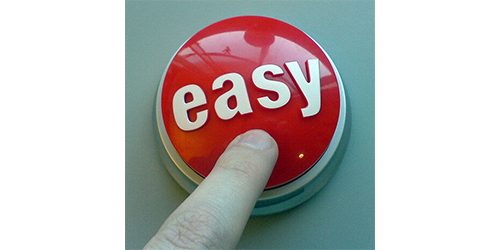
So…skeuomorphism is just a technique that helps the user relate to an interface based on visual cues that have been previously seen. The reflective surface that makes a button look like a Jolly Rancher lets the user know that it can and should be touched/clicked. Because sometimes we see large colored buttons in real life that should also be touched…
Basically, skeuomorphism helps give the user a certain amount of comfort in relating themselves to the web.
Now I think the use of skeuomorphism definitely helped bridge our connection between the tangible and the intangible. It’s been a huge catalyst in maturing our relationship with the web, however, when I look at that relationship now I find that the majority of people understand the web as the web. We no longer need that analogy to make it tangible. The web has earned its own sense of tangibility especially with the use of smartphones and tablets where we can literally hold the web in our hands. With that being said, skeuomorphism now has lost its purpose and seems more like a cheap trick that masks the true quality of an UI and I got some bones to pick with that -
We’re designing on glass.
Remember in college where one of the first lessons they teach you is to understand your medium? Well our medium isn’t the “screen” its really…glass.
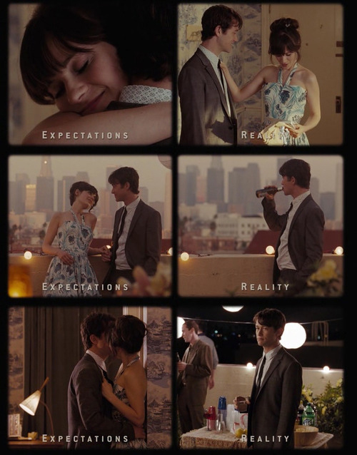
And because we’re designing on glass, at least for me, designing a button that creates a sense of reflection and depth using reflective properties not only seem redundant since your glass is already reflective, but dishonest. In real life, when a button is pushed, you can feel its give and its bounce, but on a phone or on the screen, there is a lack of that physical feedback. A physicality that your mind knows exists but in skeuomorphic reality it doesn’t. So for me at least, it becomes one of those moments where reality doesn’t meet expectations and that disappoints me.
Skeumorphism as UI
Skeumorphism is as much of an UI as the frosting is as a cupcake. Yes, the frosting is delicious, its the part that says “you should eat this”, but we all know it’s the cake part itself that’s doing all the grunt work. It’s the part that you hold, it’s the part that you actually eat, it’s the part that fills you, and it’s the part where you can slather that copious amount of frosting on. The cupcake is the UI, the frosting is just the bells and whistles, the pointless skeurmorphism that is slathered on top.
Removing the frosting doesn’t remove the cupcake but removing the cupcake makes the frosting seem meaningless, indulgent and fleeting. So when I look at UIs now, I try to imagine how it looks without all the skeumorphic styles, without the frosting. Is the UI still good? Do I still want to click that button because the copy, the position, and the size, relative to it’s context is what makes it important? Or was the skeumorphic style used just to mask a poorly designed UI in the first place?
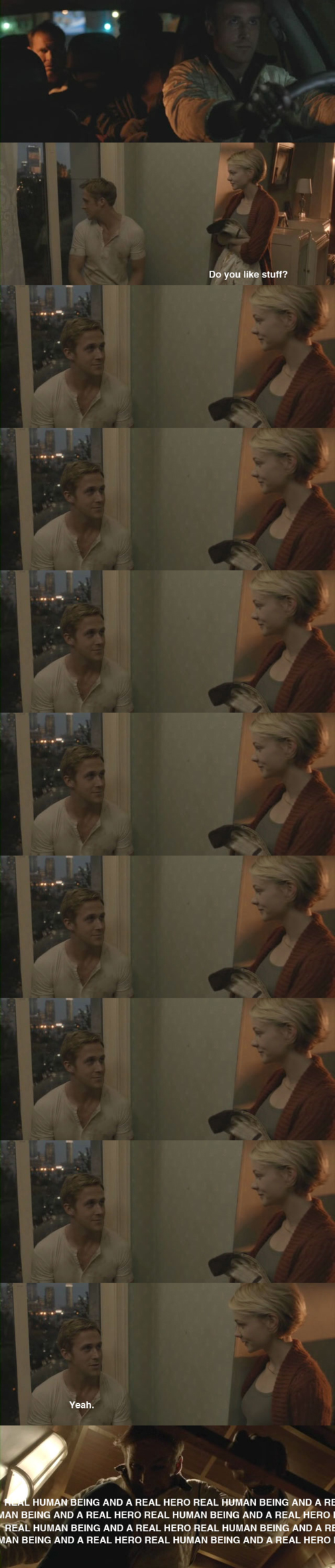
Also, skeumorphism doesn’t help the flow within a UI and we all know that the flow is what’s important. How quickly can we get a user to their destination without them thinking about it? And in that sense, skeumorphism is like that hot girl with no substance, or like that movie Drive.
This doesn’t mean I’m not visually attracted to it, because it does look attractive. But that doesn’t mean it’s something that I would do. Skeuomorphism in UI design just isn’t my cup of tea, and I like my design like i like my women…

Just kidding!