Flip It and Reverse It
TL;DR - Reverse the feed - Load refreshed content differently.
Estimated read time: 5 mins. Estimated time to understand this post: 10 mins.
Let me start off by saying, I use the words “Top, down, bottom, up, refresh, update” a lot here. It can get a bit confusing but I guess read slowly.
Recently, for one reason or another, my eyes have been hypersensitive to movement and light. I’ll assume it’s because I’ve been using f.lux for casual web-browsing and not the acute slant of my asian eyes. Basically, I’ve been noticing the way we browse our feed and how it doesn’t really make sense…Let me make my case with the Tumblr app.
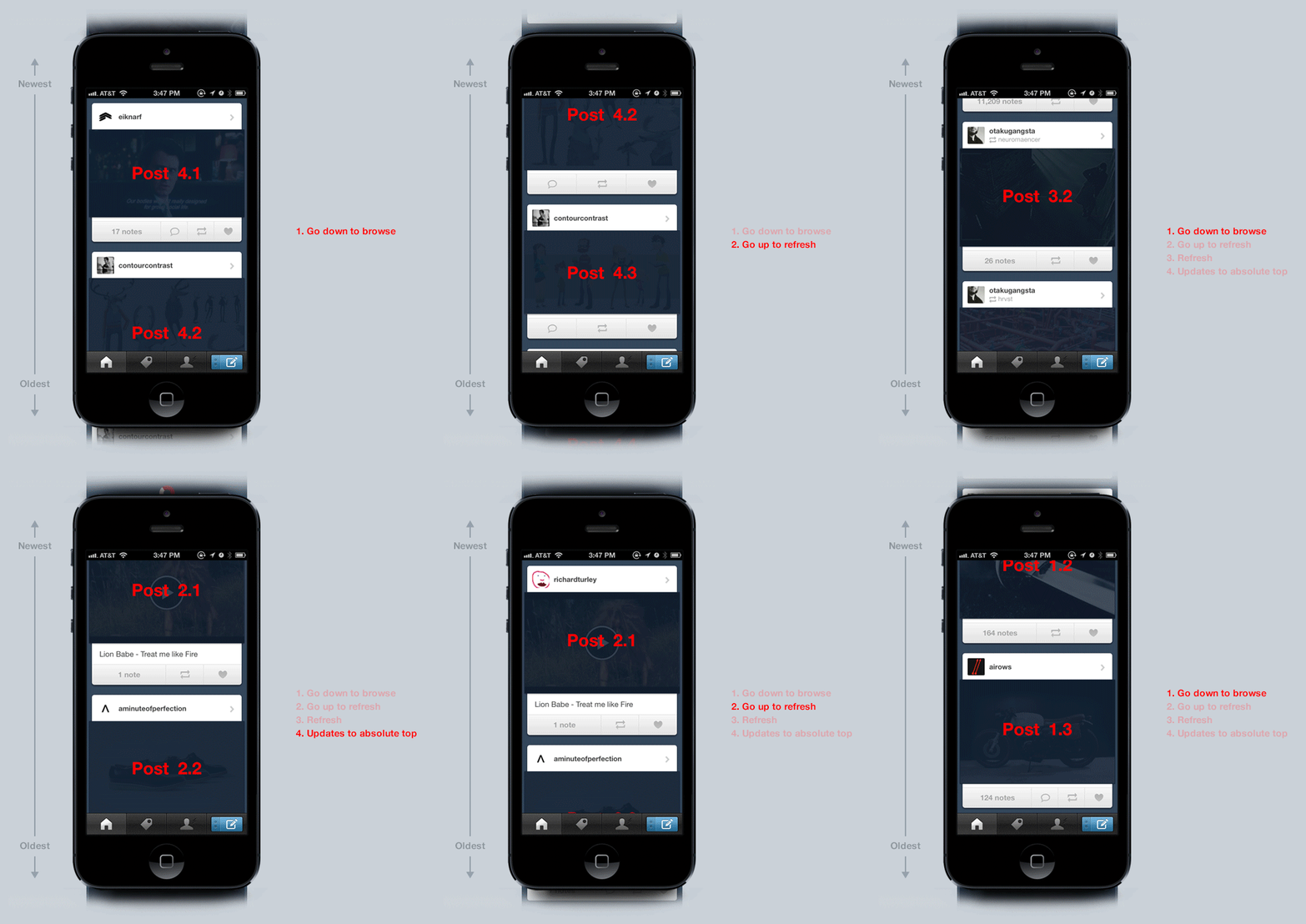
We read text or view images from top to bottom, so consuming our feed is natural in the current state of things (the feed today is ordered in reverse chronology). But once we’ve exhausted the content of the feed, to refresh, we must (on the tumblr app and probably most apps) double tap the home button or scroll up to the top. Once there, we pull to refresh. Then we’re auto-scrolled to the absolute top of the screen where we see the most recent post. To continue browsing the newly refreshed contents, we go down again (like what we did in the beginning).
This set of actions can be broken down like this:
![]()
1. Go down to browse
2. Go up to refresh
3. Refresh
4. Update takes you to the absolute top
Repeat 1-4
Visually this is what your feed is doing. (Don’t worry it’s a little confusing to follow this GIF cause it’s slower than how we actually use it, but this is for real what we’re doing)

The problem here is that we often don’t notice, or we forgive too easily if we do notice, how many different eye and screen movement it takes to browse a feed. But this browsing habit can be simplified. A solution would be to reduce the movement to only one direction.

Which leads me to my first solution.
Solution A:
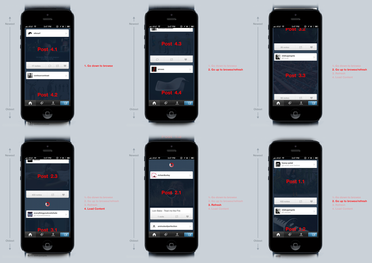
Solution A’s set of browsing actions is this:

1. Go down to browse
2. Go up to browse/refresh
3. Refresh
4. Load content but don’t push the user to the absolute top (Instead, crop the screen with newer content above the viewport)
Repeat 2-4 (You don’t need step one now because you don’t need to scroll down to browse content already seen)
In action, Solution A would look something like this:

By not allowing the app to auto-scroll you to the absolute top after a refresh it forces the user to manually scroll up themselves. By manually scrolling up to view unseen content, it encourages the user to browse the feed in one direction, in this case, up.
But Solution A isn’t exactly correct just yet. It has a huge usability problem. To my earlier point of how we read content (top - down). When we scroll up to see new content, each post is coming into view from the top (which means we’re seeing the bottom of each post first).
The flaw here is that we have to mentally log each post from the bottom-up • then • read • each individual post top-down. This would get old and annoying real quick.
Also we can remove step one of Solution A which is the first downward direction of browsing the initial content.
By the way, Solution A is what the Twitter App does.
But the key to a better solution can be found in this Missy Elliot Song
Solution B:
All we have to do is flip it and reverse it.
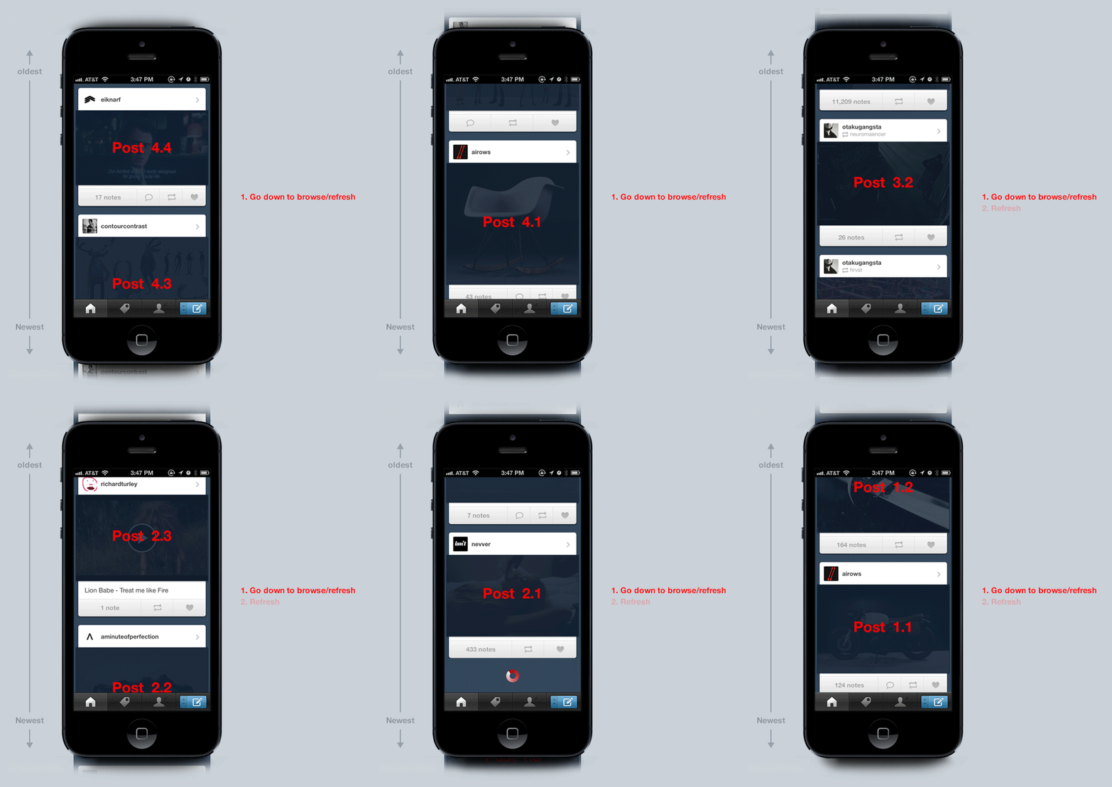
The actual way to solve this is to order the feed in chronological order (newest at the bottom and oldest at the top). By ordering the feed this way, the user can scroll down to browse • and • scroll down further to refresh and browse again. In one direction.
The breakdown of Solution B is this:
![]()
1 Go down to browse / refresh
2 Refresh
Repeat 1-2
And this is what it looks like when you apply it:

IMHO: I think this makes the feed lighter, and I’m pretty sure this can be applied to most feeds. (Sup Twitter)
I know this sounds a little confusing but it’s really not.
The point of this is to simplify eye and screen movement when we’re browsing the feed. It’s a minute detail that can be arguably trivial. But, in my defense as a designer, these are the details we live for. And besides bro, we’ve had bigger discussions about more trivial design shit than just basic eye and screen movement.
Also… this idea can only work on mobile since the device is more forgiving of content orientation. Reversing the feed will probably fail on a tablet and definitely fail on the desktop due to it’s more traditional top-down orientation.
Also tumblr app, no hate over here, just sayin’