Pull to Create
Estimated read time: 4 mins
The act of creation and consumption have always been separated. You create content in one environment and you consume content in another, there’s no dialogue between the two. I understand there are certain limitations to this but I’m not talking about creating content in Photoshop or anything…I’m talking about User Generated Content on Twitter, Instagram, or Facebook. You know, these quick throwaway thoughts that we want to share with the world. And for the sake of argument and clarity, I’m going to use Instagram’s UI -to illustrate my point.
So…to close this gap between creation and consumption, we need to first make users feel like they’re closer to their community. As human beings, we have an innate need to communicate. From the primal need of survival to the higher desire to express feels.

Humankind have invented tools for us to achieve that, from symbols to languages, telegrams to telephones, snail mail to email and texting to sexting. All of this is an attempt to make communication more efficient, to make it faster and to get us closer with each other.
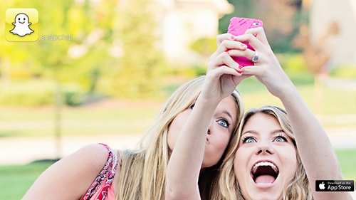
Second, we need to make the act of creation more visceral. As humans, we’re soft-wired to be pathetic and empathetic, to experience another’s plight as we are experiencing our own. We even make technology more human, like artificial intelligence that mimic human qualities so we can relate to it more. This is all an attempt to reduce the UI and make technology disappear, so we can interact with it on a deeper level.

Now with that said, I think the following UI can get us closer to the devices and products we use. It isn’t even ground breaking, in fact it’s extremely simple. It’s so simple that I don’t know why no one has done it yet. So here it is.
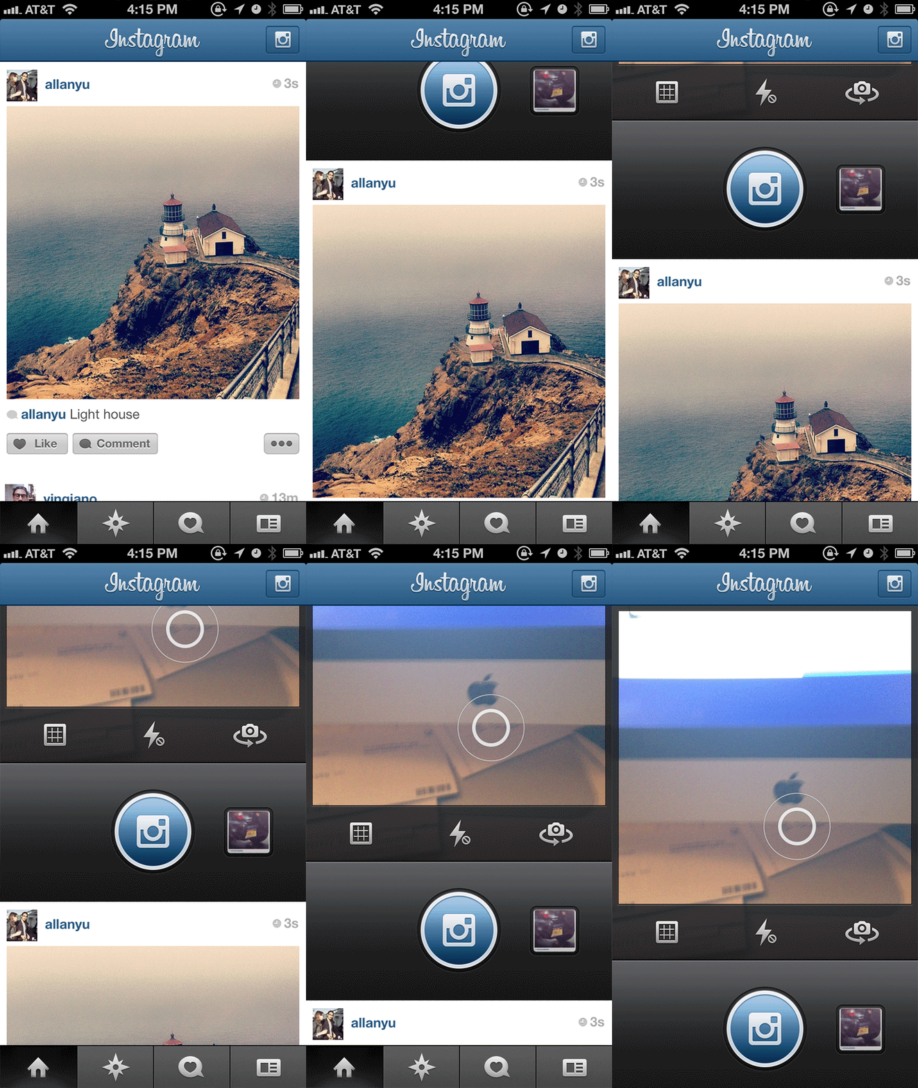
Instead of pull to refresh, pull to create.

Generally, when you create content, the create UI animates from somewhere and the content is posted at the top of your feed after a noticeable refresh. But that’s the separation! If your content is going to be at the top, why doesn’t the UI come from the top as well?
By pulling to create, you feel like you’re literally adding something on to the feed rather than having the feed refresh separately from you. This will make you feel like you’re directly contributing to your community.
Next
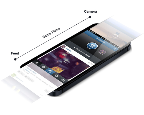
Putting the creation and consumption UI on an equal plane as oppose to it sliding as a “card” from the bottom up (e.g. Twitter/Facebook/Foursquare etc.), or appearing as a new screen load (e.g. Instagram, Snapchat, iOS Camera etc.) also shortens the gap and enhances the dialogue of creation and consumption.
Finally
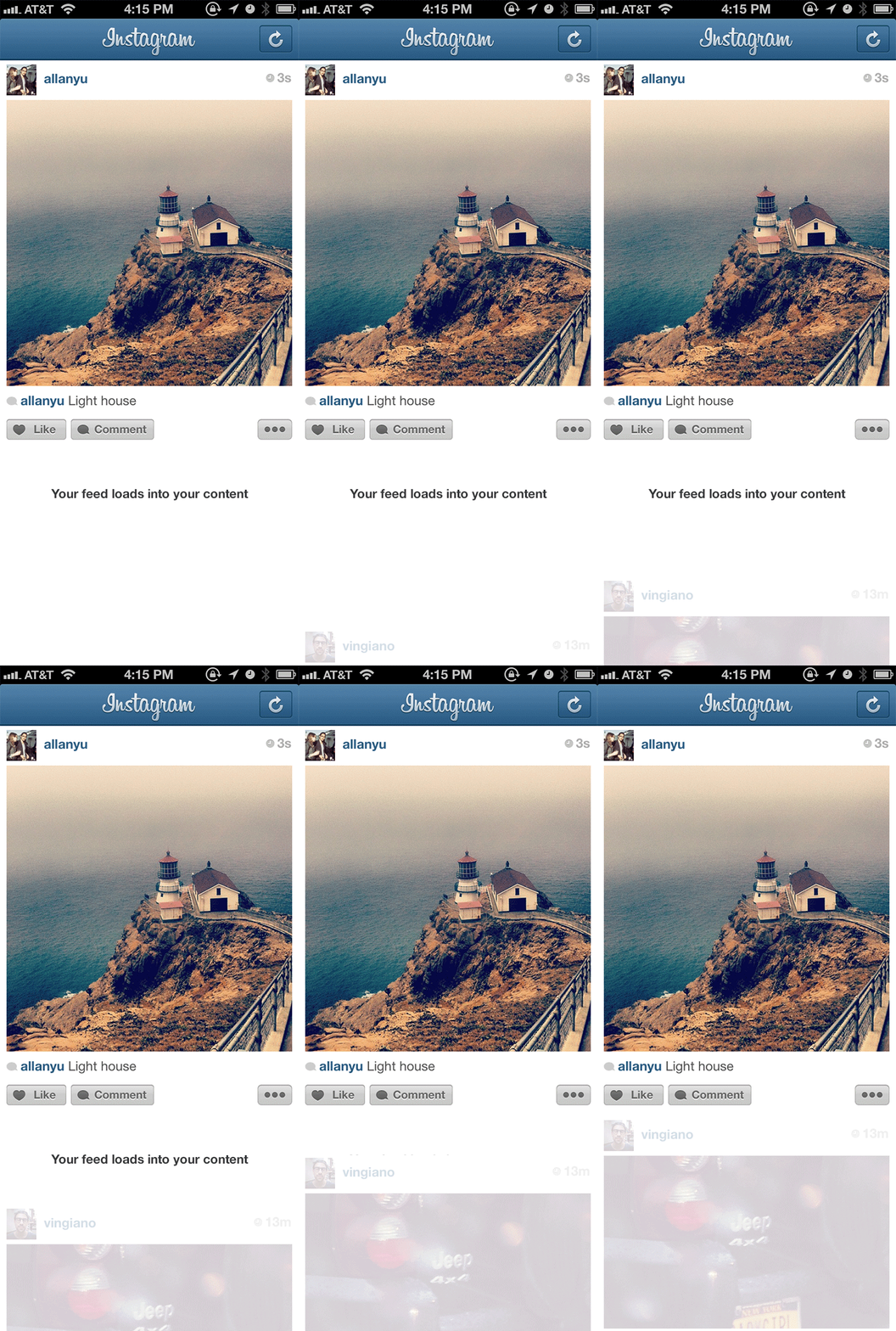
This animation here is pretty crucial and it emphasizes my earlier point of directly contributing to the community. The feed is loaded back into the content we just made rather than the entire feed being refreshed, like every app on this planet. Again, by constantly showing the user that their creation and their feed is directly related at all times, we can focus people’s attention on how it feels to create content.
And maybe if we feel closer to the content we create, then we’d feel more responsible for it and stop creating stupid (late night drunk sub tweet) content. By the way, I am totally guilty of this.
–
I know there are some issues with this UI so let me address some of them for you and please let me know of one’s I didn’t think of.
Problems with it:
You can’t create unless you’re in the feed.
Yeah, that’s true but as a user, we’re generally in two mental states. The state of creation and the state of consumption. We don’t look at our Instagram Explore page to feel inspired and then snap a photo, we look at the world around us and snap that shot.
But also, it depends on what your priorities are. Do you want to contextualize the act of creation or do you want to make creation accessible at all times? I don’t think there’s a right/wrong answer here.
–
Where does the refresh go?
There are two solutions to this problem:
1. Take a page from Clear App where there are two pull down states, the first to refresh, and the second to create.
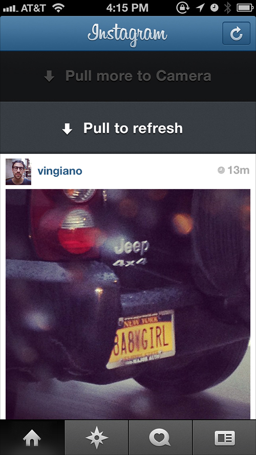
2. Put the refresh as a stand alone button, like the current Instagram UI.

You have to go to the top of the feed in order to create, so if you’re all the way on the bottom it’s quite difficult.
Yeah I know…But like I said, if you’re in the act of consumption, you’re rarely in the mood to create. And you can work around this by double tapping on the logo or the section you’re in to get back to the top of the feed if it’s really that big of a concern.
–
What if people don’t know about this UI?
Well, this is pretty easy, you can either put this in your walkthrough or…
The Timid Version, where you would use just a regular button on the top right like any other app but have the animation come from the top rather than from anywhere else. This still creates a similar effect but in my opinion, pretty boring.
Anyways, this post and this UI might be stupid and there might be more flaws to this than what’s currently out there, but I know for a fact that this UI feels more lightweight and easy than any creation process on the market today. Nate Stedman and I have been playing around with this concept for a while and I want to take this opportunity to thank him for actualizing this idea (I love you booboo).
Soo yeah thanks for reading this, and look, I may be wrong and this might not be for you but what’s the point of innovation if we’re always trying to please the status quo?
